Context & Problem
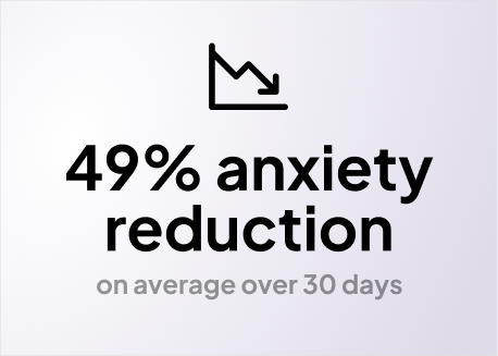
Pilot product and study confirmed treatment efficacy (49% anxiety reduction), and illustrated clear areas of improvement for the product experience.
The pilot was designed to be built as quickly as possible, while being able to rigorously test treatment strategy. As a result, UX tradeoffs for engineering speed came up clearly in the research findings of the study.

PILOT STUDY USER FEEDBACK OVERVIEW
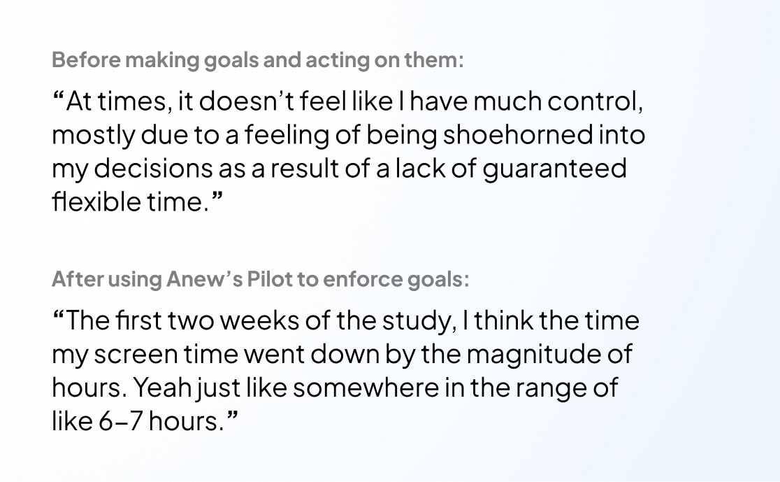
ANONYMOUS STUDY PARTICIPANT BEFORE/AFTER QUOTES
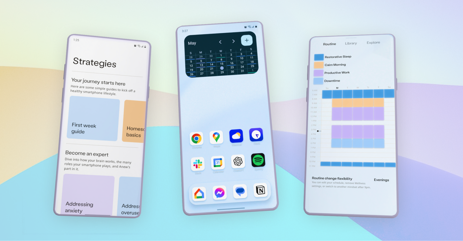
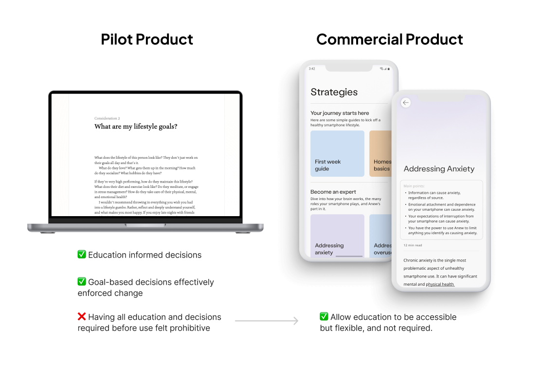
Key pilot insights: the user experience must be consolidated to a single mobile experience, and treatment success was based on application blocking within a routine.
There were a significant number of issues that arose in the pilot study due to splitting the user journey across desktop (for user customization experience) and mobile (for using the configured OS). Issues were both technical and UX. Given that using the desktop didn't necessarily impact the user's ultimate success in treatment, the same experience could be unified on mobile.
There were a number of secondary features that played a role in reducing user anxiety - education, goal setting, and homescreen icon editing. However, these feature-sets increased solution effectiveness, rather than caused it. App blocking based on the user's routine, represented on a routine-specific homescreen, is what catalyzed and sustained behavioral change quickly and consistently over time. This ultimately caused the observed anxiety reduction.
Given resource constraints, market validation was the next priority.
To monetize the product based on its treatment strategy, a publicly usable product needed to be released as soon as possible. Treatment efficacy was a good first signal helping to de-risk moving forward, but the next priority to de-risk further investment was to engage with a user base that would find a high value in solving these problems, and validate their appetite for this solution and product.
Funding via bootstrapping was still tight, so any further investment of time and resources had to be based confidently on further real world findings.
MVP Launch & Feedback
With a focus on essential treatment features, a mobile-only MVP was designed and engineered in 3 months.
Validation was the priority, so something usable needed to be shipped publicly as soon as possible. With a focus on key features, and leveraging learnings from the pilot, I designed the information architecture for an MVP quickly.
Engineering was expedited by leveraging the pilot product's original codebase.
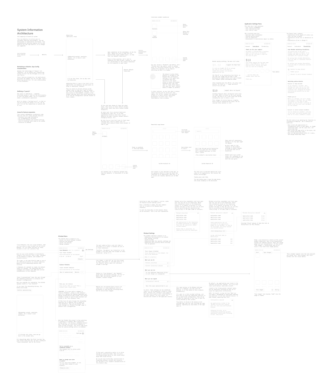
IMAGE OF LOFI SYSTEM DIAGRAM FOR MVP
What was cut from the MVP, and why?
The MVP provided pilot product features, such as:
-
Customizable routine, to set when the OS would change to have different custom settings.
-
App blocking, to determine access based on routines, which was essential in addressing anxiety.
-
Homescreens based on routine, as users associated a uniquely digital “space” with what applications were blocked, and what weren't.
What the MVP cut, were a number of pilot features and standard homescreen features, including:
-
Homescreen widgets, as they greatly increased engineering complexity and production time.
-
Complex homescreen interactions, such as animated drag-drop, app and widget menus, additional dashboard creation, and other “product category standards”.
-
Icon editing, as it was a “nice to have” to improve treatment efficacy.
-
Website blocking, as it would address holes in app blocking strategy, but wasn't necessary upon first launch.
-
Educational resources and goal setting guidance, as these also greatly improve efficacy, but do not enable outcomes by themselves. Adapting this strategy to mobile would take additional time and testing.
Due to limited design resources, I brought on Anew's first intern who defined the product's brand.
Even for a public MVP, our product was changing large aspects of the user's daily OS experience. Design consistency and polish would be beneficial not only because we'd be more attractive on release. Style guides, type stack, color guidelines, and brand tone allow design and production to move much more quickly - they greatly speed up high fidelity design processes by standardizing common design decisions, especially as UI systems scale.
See the internships case study for more on intern contributions.
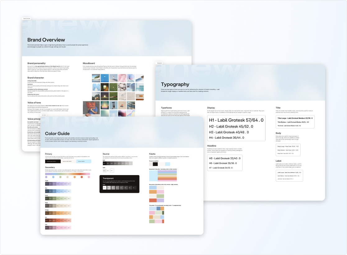
WEIYI'S BRAND GUIDELINES SAMPLE
Anew's marketing advisor, in charge of a 65,000 user forum, supported our MVP launch.
Jose Briones, who had been a partner for months advising on product strategy and features for our target market, gave us access and credibility with his significant audience.
We gained 5k visitors in under 24 hours, and got a lot of feedback very quickly.
Users were highly attracted to our value proposition, and illustrated clear expectations for product improvement.
Our launch informed users of our approach, why it was novel, why it was more effective than competitors - and that excited our new base. However, the MVP was now competing in the “Android launcher” market, which are essentially installable homescreens. The players in this market are Samsung and Google. As a result, users are used to a high degree of visual and usability polish with this product category - something Anew's MVP did not prioritize.
Beyond the missing features and polish, the MVP also had bugs. Android phones come in a range of performance tiers and screen form factors - which was not heavily considered in the MVP.
The lessons: The value proposition was validated by MVP launch, but to compete in this market the design scope had to increase to meet expectations.
This confirmed the market was hungry not only for a solution - but for our type of solution. It validated we were meeting an unmet user need, in a way users understood and were excited to engage with. This reduced risk of further investment, as we had a glimpse of the response of a much larger market.
New Constraints & Execution
Production strategy required a complete pivot.
Prior to MVP release, the plan was to work with users to identify feature priority, and roadmap based on efficacy improvement and user interest. This would build gradually on the existing MVP.
The MVP showed it had major shortcomings based on user feedback, that wouldn't just require gradual improvements.
Engineering would be significant to deliver market parity meeting user needs, so the design approach was adapted to mitigate design and technical debt of the resulting product scale.
Early consideration on how the required core features of homescreen standards, and our additional treatment features, would be represented was critical.
Many product features weren't isolated into independent feature-specific UI. They had many codependencies. The risk of designing the feature set one-feature-at-a-time, is that they would not be integrated as cleanly as if their design was considered up front.
At the same time, on-feature-at-a-time implementation would risk “spaghetti code” and mounting technical debt with each new feature.
The gradual feature by feature design and engineering approach would work in the short term, but given the necessary product scope it would make design and implementation extremely costly beyond even a 6 month horizon. All this, while hampering usability and product experience which is essential in this product category.
A new engineering advisor, the founder of a 5M+ user base homescreen app, helped steer the pivot.
Peter Huber joined as an advisor, guiding everything from technology stack selection and rationale, to implementation strategy. His lessons as a current engineering founder expedited production immensely.
One key change he recommended was shifting UI development from XML to Jetpack Compose, which accelerated UI development and testing by over 5x.
Additional internships were hosted to expedite design and development.
Internships were hosted to add resources towards speeding up design validation and engineering. Computer science interns focused on technical proof-of-concepts for critical features, while design and research interns focused on feature validation and user testing.
Validation & Iteration
A 5 month design and research cycle was executed to ultimately expedite production, and de-risk engineering.
The question was, how can this product be brought to market as quickly as possible? The value proposition was validated. The design standards of the homescreen product category were low risk, as users were already familiar. And our treatment feature set strategy was validated in the pilot.
The biggest unknown, and risk, was how to adapt our effective features into a mobile-only product.
Waitlist users from the MVP launch and advisors provided feedback on prospective design mock-ups prior to engineering.
After the MVP launch, I was consistently getting emails from interested users on more than a weekly basis. I created a list of them combined with the MVP early adopters to get feedback on prospective design approaches for our feature set.
I sent them design docs with short explanations to solicit feedback. What were their thoughts, what made sense, what was confusing, what was helpful?
EXAMPLE FEEDBACK DOCUMENT TO SOLICIT USER & ADVISOR IMPRESSIONS OF DESIGN
Advisors across development, design, psychology, and marketing were also probed at each step of the way via multi-hour video chat critiques and email correspondence.
Once the product was ready for launch, a closed beta was released and limited to 30 users.
The priority at this stage was expediting product improvement. With a public launch, there would be a deluge of repeated feedback on bugs and usability. The goal of a smaller closed beta was to allow a manageable volume of bugs and feedback, and be able to address them, before making the product fully publicly accessible.
Further, it would take time to get publishing approvals on Google Play, which would slow us gaining feedback. Approvals were not required for closed beta releases.
After launch, non-critical features were gauged with users, prioritized, and gradually implemented.
Bug fixes, quality of life improvements, adoption efficiency, and product content were all gradually improved and expanded in collaboration with early users.
Feature Adaptation From Pilot
Design principles were defined based on findings from the pilot, to help govern commercial design production.
There were a few larger learnings, that influenced the whole product:
-
Adoption must be simplified; the pilot had prohibitive onboarding overhead.
-
Free exploration, with available guidance; users want to try features, but enjoy learning and receiving help at their own pace.
-
Significant customization is required for treatment outcomes; recommendations and automation, reducing manual setup, can improve user experience, retention, and treatment efficacy.
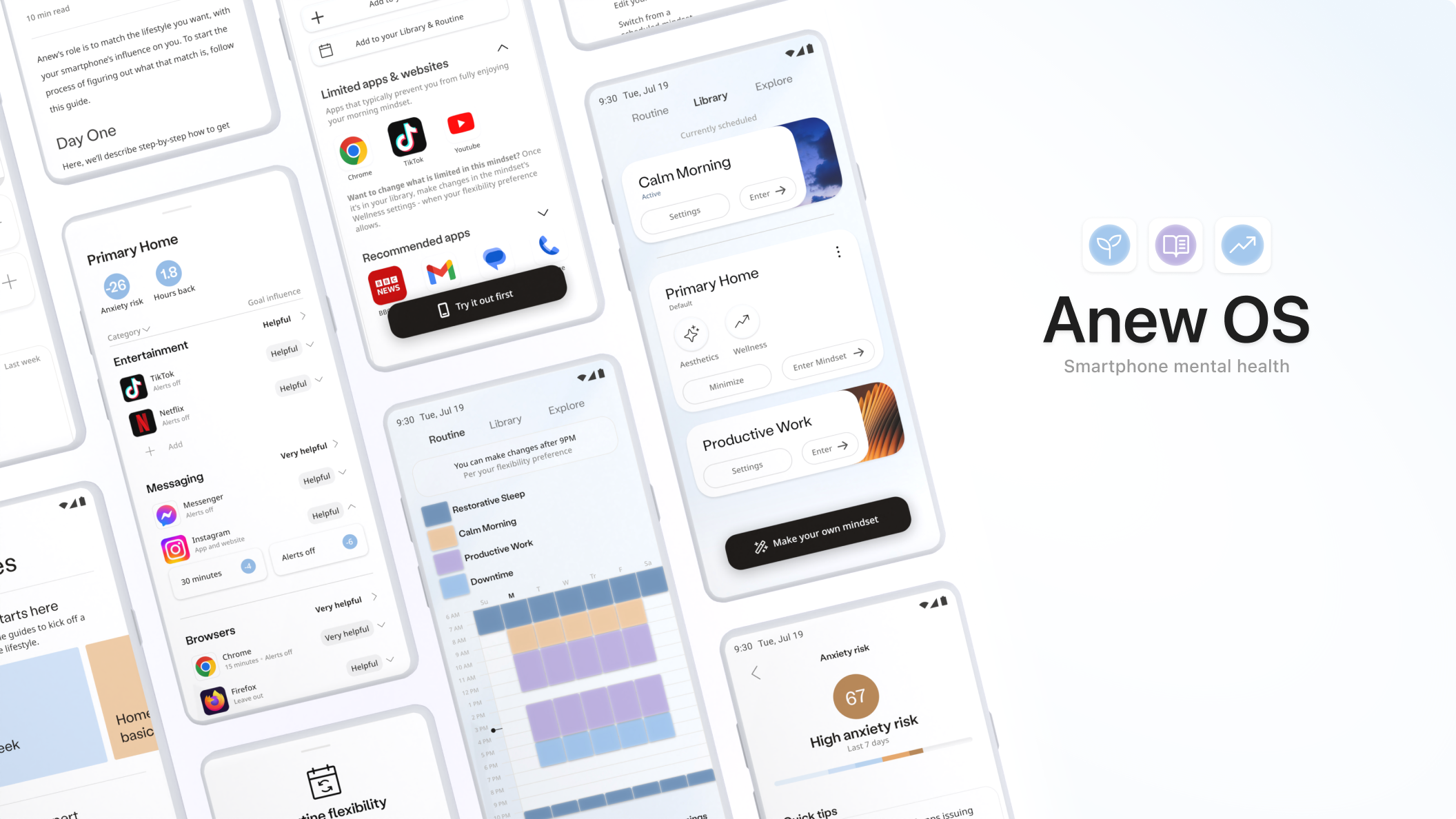
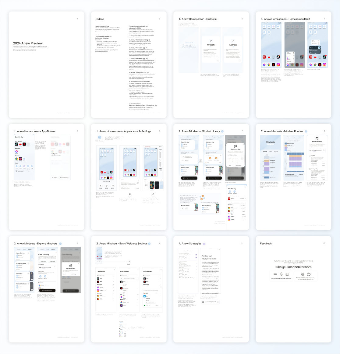
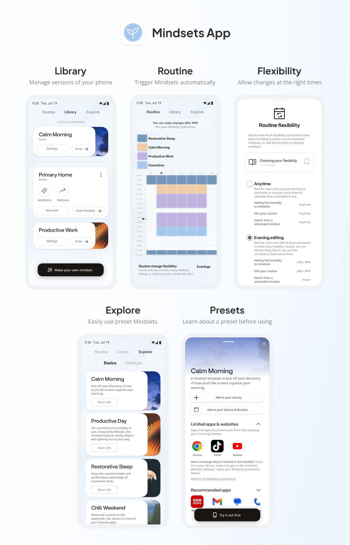
Mindsets Feature: Routine-based versions of the phone for treatment consistency.
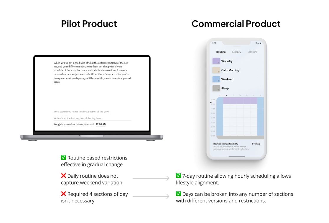
Mindsets let users create different versions of their phone and schedule them on a daily routine. Each version consisted of a custom homescreen, blocking preferences, and other customizations. This duplicated the pilot's most effective treatment strategy - curating the phone to user's needs based on routine. But now with a simplified setup designed for mobile.
EXAMPLES OF PILOT ISSUES AND HOW THEY ARE ADDRESSED
KEY UI OF MINDSETS APP, BUILT INTO ANEW

A SINGLE MINDSET'S WELLNESS SETTINGS UI SAMPLE
Why design changed: reducing friction, preserving impact
The pilot showed Mindsets were critical, but setup was clunky. To simplify onboarding and adoption, I prioritized simplicity over full customization upfront: fewer steps to create a routine, Mindset presets for common use cases, and a weekly routine for more flexible scheduling. This way, users could make a Mindset in seconds, play around with customization at their own pace, and discover supplementary features gradually.
ITERATION 2 LOW FIDELITY DESIGN OF MINDSETS (WITH DEVELOPER INTERACTION/STATES SPEC)
In the process of creating the commercial product, design drafts were sent out to our most active users in the waitlist, and to relevant design advisors. They noted particular areas of improvement in:
-
Information density of the Mindset Library, which muddled the main purpose of the UI.
-
Usability concerns of the Routine interface, with non-obvious affordances.
-
Information hierarchy and clarity on Mindset Preset description pages.
Based on this feedback, the Mindset Library was simplified in both function and information. Various design options were tested with users to improve the Routine interfaces affordances to be more intuitive. Mindset Presets underwent 2 iterations of user feedback to refine them to a point where they were simple, helpful, and showed they improved new user onboarding.
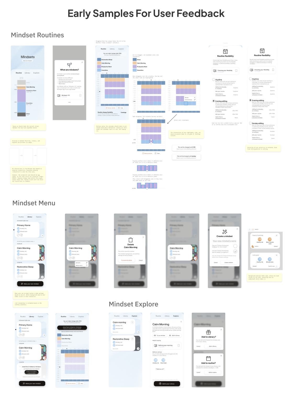
HIGH FIDELITY SAMPLES USED IN USER TESTING FEEDBACK SESSIONS
Upon beta release, users leaned into app blocking, and later website blocking.
One user in particular had a work Mindset with over 20 apps and websites blocked - from social media to eBay. This illustrated not only the value of the blocking features, but the scale of their problems previously unaddressed before using Anew.
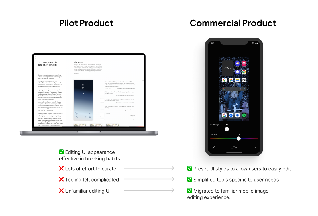
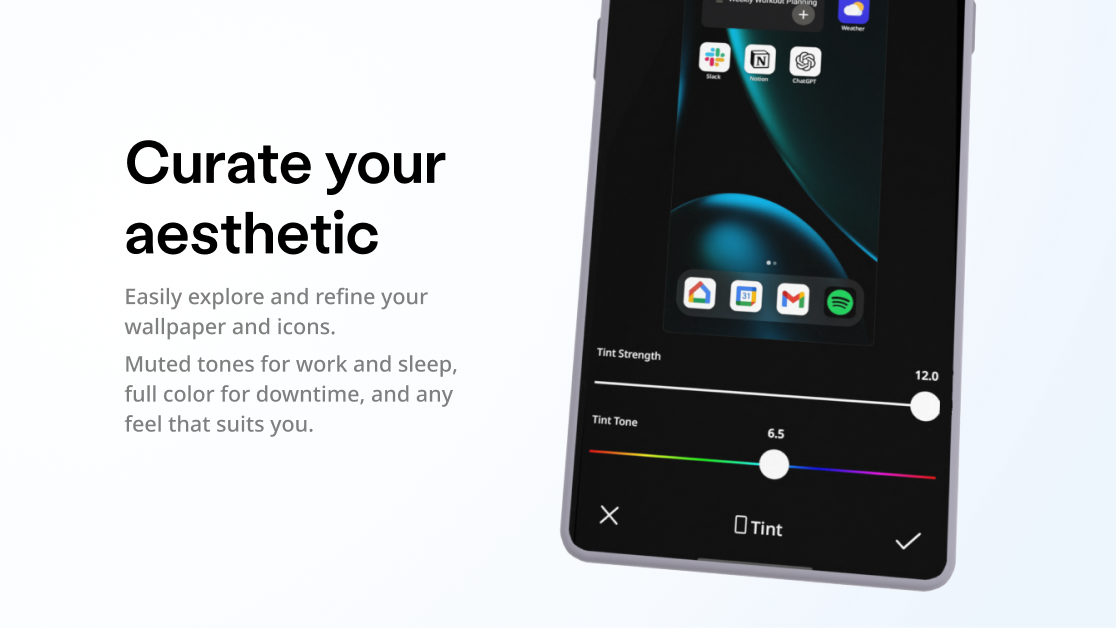
Aesthetic Editor: Editing icon and homescreen visual representation helped change user habits and normalize new ones, reinforced by consistent visual environment.
In the pilot findings, users indicated that changing the icons for apps they had trouble overusing helped them break habits. And by picking new iconography for apps, they were able to be more intentional about opening them, as they had to re-identify what apps corresponded to what icons they picked.
Why design changed: simplified controls, less “tedious” process
Creating a custom homescreen UI that reflected the users needs, both in regard to function, and visual mood, was a communicated value add. However, many users found the pilot's UI creation to be tedious, and allowed too much flexibility in some aspects.
Key takeaways were:
-
Users wanted a background and icons that had a unified color palette (aesthetically pleasing).
-
Users prefer sampling options over custom curation tools.
In discussing these issues with Anew's brand designer during early critique, she pointed out that users are likely familiar with the photo editing app user experiences, both in regards to visual experimentation and UI patterns.
EXAMPLES OF PILOT ISSUES AND HOW THEY ARE ADDRESSED
Given a tight timeline release timeline, I hedged the risk of not user testing this direction, with the knowledge that mobile photo-editing UI standards were consistent across that market. And fundamentally, a user editing a homescreen to be aesthetically pleasing is a very similar goal to editing a photo to be aesthetically pleasing.
I also cut the scope of the editor by omitting custom icons initially. Users indicated in the pilot that both changing the color and icon for apps helped them change their behavior. Because the engineering cost of changing app colors on the homescreen is much lower than engineering custom icon features, those icon features were backlogged out of initial launch scope.
The editor provides homescreen visual presets (much like a “filter” preset in a social media photo editor) to allow for quick sampling, as well as specific controls for color tint, brightness, and saturation to get the feeling just right.
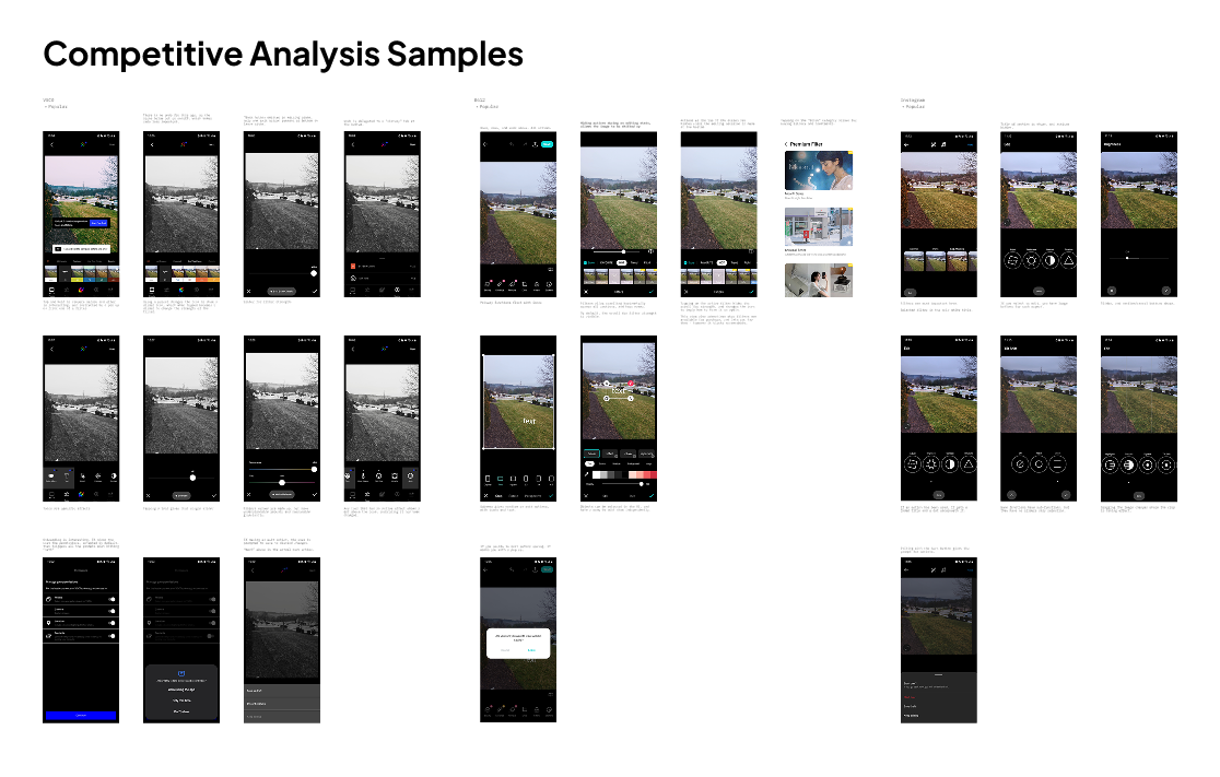
PHOTO EDITING APPLICATIONS UI MECHANICS COMPARISONS

LOW FIDELITY SAMPLES OF ANEW EDITOR FEATURES REPRESENTED BY COMMON INTERACTION PATTERNS

HIGH FIDELITY AESTHETIC EDITOR DESIGN SPEC
GOOGLE PLAYSTORE MARKETING SHOT
Education Feature: The “Strategies App” provided access to guided goal setting and targeted advice on how to use Anew to address specific mental health concerns.
In the pilot, goal setting was the “mental scaffold” around which decisions about app limitations, and routine organization, was based. Many users of the pilot product indicated they had never even gone through a personal goal-setting process. Doing so made them feel empowered and in control of their outcomes, which then gave them the confidence to make decisions about their routine and lifestyle.
Why design changed: high manual overhead, unnecessary requirement for use
In the pilot, educational content was mandatory during setup. New users who weren't yet convinced of Anew's value wanted to try the core features first, then decide whether to invest time in goal setting and education.
EXAMPLES OF PILOT ISSUES AND HOW THEY ARE ADDRESSED
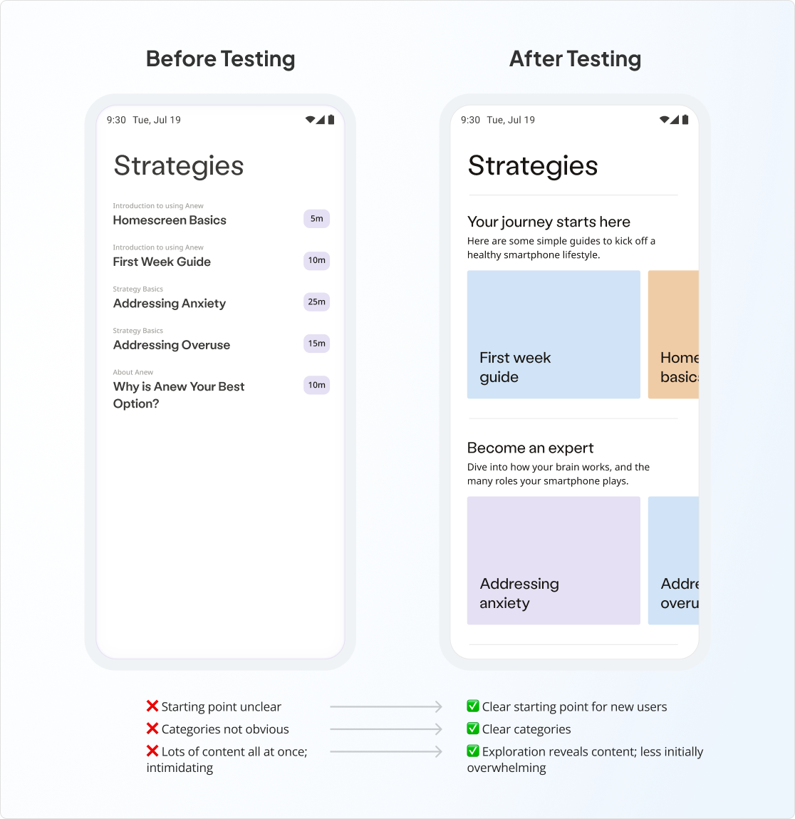
The Strategies App was taken through feedback rounds with beta users and design peers. Most notable findings included:
-
Poor visual hierarchy on the Strategies homescreen left users unsure where to start.
-
Different fonts, prioritized for long-form content readability, made the app feel disconnected from the rest of the Anew brand.
To address hierarchy, peer-suggested design patters from Robinhood were reviewed, and aspects were leveraged in design improvements. Similar to Anew, Robinhood has a specialized product that provides optional, but conceptually dense, learning resources that can improve user outcomes. Their strategy to enable gentle exploration without overwhelming users was leveraged in the Strategy App's design improvement. This design update was later tested for feedback with the user waitlist, who reported that the new flow felt more approachable and easier to explore.
BEFORE/AFTER USER TESTING OF STRATEGIES APP HOMEPAGE
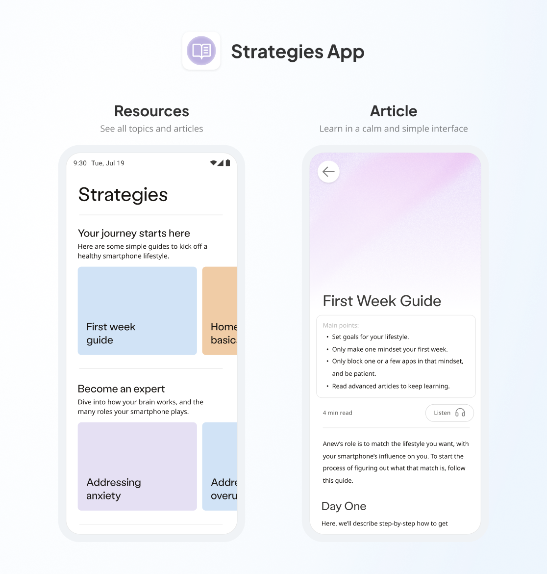
KEY UI OF STRATEGIES APP, BUILT INTO ANEW
Users did benefit from some initial understanding of Anew upfront, so a limited onboarding tutorial was designed to allow users to learn about critical features, to allow them to easily explore the app on first use. This sequence's design underwent testing and critique with several beta users - see iteration 3 below.
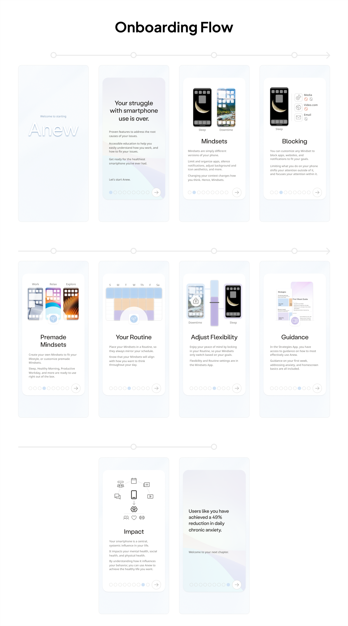
ONBOARDING ITERATION 3 BASED ON BETA USER TESTING FEEDBACK
Recommendations Feature: Setup required significant personal reflection about lifestyle and phone use, which could be expedited with automation and data-based guidance.
The pilot was able to achieve a 49% reduction in anxiety, in a large part due to the accuracy of user decisions to their personal needs. However, this required significant upfront effort.
To reduce the load on users creating parts of their routine, and defining their settings, we could instead leverage existing usage data on the phone. Usage data tells us what apps were used when, and for how long.
Pilot users asked about this type of functionality in exit interviews, suggesting it would be helpful to see analysis of their use to help them make decisions and understand their progress.
Why design changed: achieving value proposition required significant user effort
Recommendations require technical and strategic overhead, but have significant upside improving both efficacy and ease of use. Initial consideration consisted of:
-
What is the methodology to take user data, generate recommendations, and evaluate their impact?
-
How will recommendations be framed to the user?
-
How will recommendations be represented in the product experience?
To make recommendations easier to understand for the user, and more accurate, a model was created for assessing user risk of anxiety based on their usage patterns of behavior with their phone.
This model allows us to estimate what apps have the highest risk of increasing user anxiety, and surface them more strongly as recommendations. All of these recommendations are then available in the “Wellness” app.
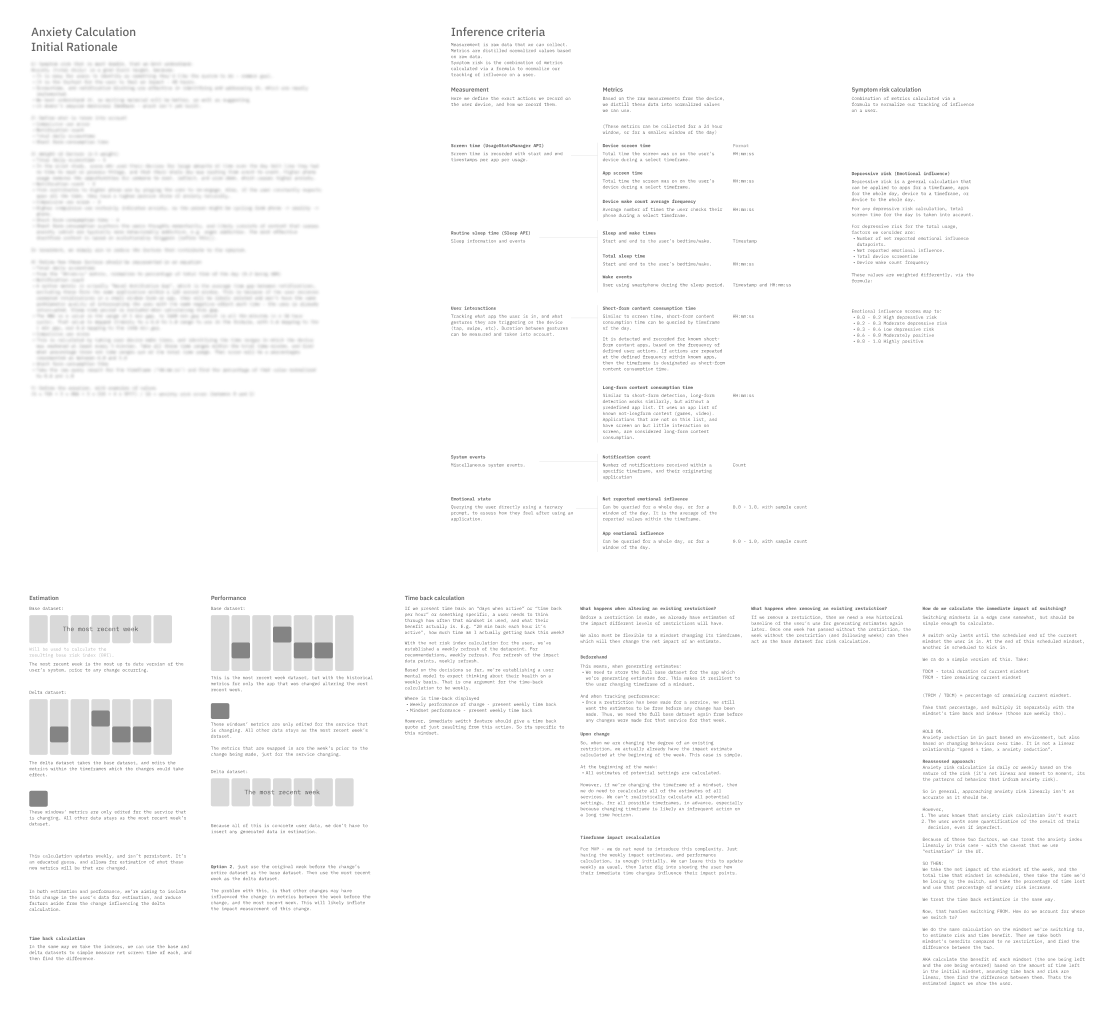
SUBSET OF TECHNICAL OUTLINE CONTENT (ANXIETY RISK INDEXING AND MODEL RATIONALE)
To ensure recommendations were not only effective in improving treatment outcomes, and easy to understand for users, I worked with a practicing therapist who focuses on anxiety disorder treatment. He, along with design peers and advisors, helped to establish how to represent recommendations in the product UI, and how to communicate their impact.
-
Any limit set in Anew to block an app, website, or app notifications, could be measured (anxiety risk index) based on how it's omission would impact the user's daily phone use.
-
Based on this measurement, we could display settings recommendations with highest impact on the user's estimated anxiety risk. Users could open the Wellness app and immediately see 2-3 simple, high-impact changes suggested for their routine.

TREATMENT OF WELLNESS SUB-BRAND VISUAL LANGUAGE

KEY UI OF WELLNESS APP, BUILT INTO ANEW
This recommendation system was strategically important not only because it addressed a core flaw in the product - high manual onboarding overhead - but also allowed users to quantify how their behavior and health were improving based on our models.
Quantified feedback allows users to understand benefits, especially for long-running changes. Just as weight-loss doesn't feel different day-to-day, improving phone use doesn't have that “wow” moment, unless you quantify the change over time.
Impact & Outcome
Commercial product launched and validated.
We successfully built and launched a commercial-grade product, integrating core treatment features from the pilot into a unified mobile app. Anew received Google Play approval and reached a global audience, with early adopters confirming its ability to reduce unwanted use and improve wellbeing.
Monetization strategy tested, but runway insufficient to integrate.
Working with advisors, I tested pricing models and mapped a path to monetization. However, forecasts showed we would need 6-9 additional months of marketing and growth runway to reach profitability. At the same time, deep Android integrations created higher-than-expected engineering overhead, making stability across devices and versions costly.
Strategic wind-down, product remains accessible.
Given these factors, I made the strategic decision to wind down operations at launch rather than overextend. Anew remains free on Google Play to continue helping users self-treat overuse and mental health challenges.
Since release, I've received acquisition interest from startups manufacturing “health phones,” but I've chosen to keep the product open and accessible.
Proved treatment efficacy and purpose.
Ultimately, while Anew did not become a sustainable business, it demonstrated that following research, exploring the problem deeply, and iterating under extreme constraints could lead to a solution that provided real, measurable treatment.
The product showed that a smartphone-based intervention can reduce anxiety, that users are motivated to adopt it, and that such solutions can be made publicly accessible at scale. I turned research into a product creating significant real-world impact.
I achieved what I ultimately set out to do, and today Anew is being used all over the world to help users who need help.
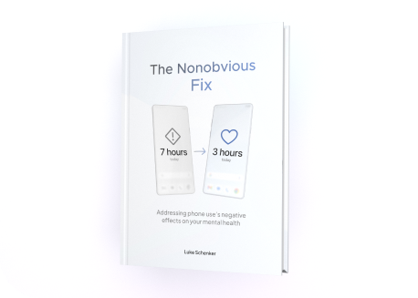
To complete the wind-down of Anew, I distilled its research, findings, and expanded upon its theory in a book.
For more information about Anew's treatment and design strategy, request a copy of my book “The Nonobvious Fix” currently in peer review. Request via email luke@anew.so, or read a summary of the book on this website.
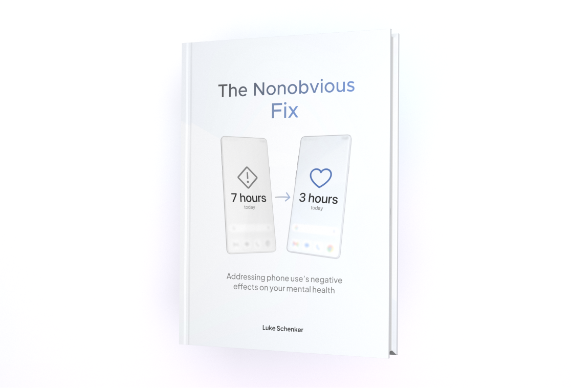
BOOK COVER RENDER