Context & Problem
Any point in which driving paths on the map intersect, or get too close, must be assigned a “conflict” annotation.
This annotation tells the autonomous car whether or not it has the right of way when another vehicle approaches its projected path. In even a simple intersection, there can be dozens of conflict annotations that need to be created and audited for accuracy.
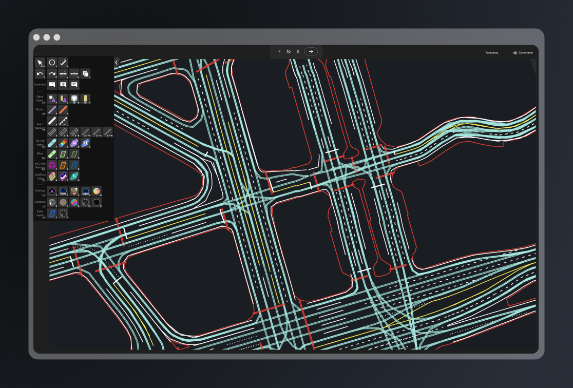
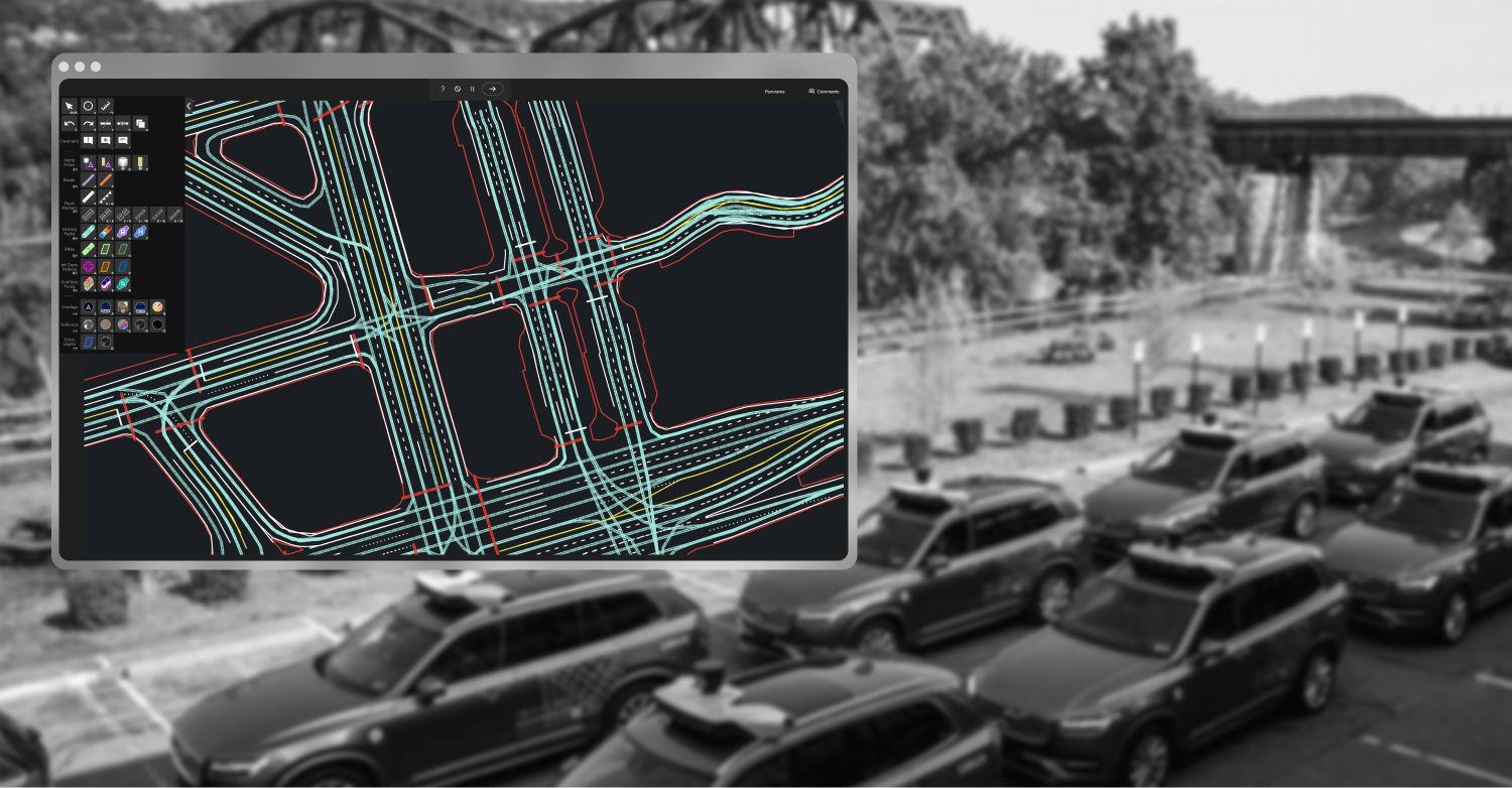
EXAMPLE OF DRIVING PATHS VISUALIZED IN MAP MAKER APPLICATION
The business recognized that inefficient conflict creation was a mounting problem. As we scaled up mapping efforts, the inefficiency of creating conflicts had a growing negative impact on production cost.
Of all features, conflicts was the clearest bottleneck in map production. The business was also planning on spinning up a team in India in the next few quarters, with an operational cost of $1.2M/mo for that team. This would be added on top of the Pittsburgh mapping team's $250k/mo operational cost.
More importantly, we couldn't as easily retrain and collaborate with users in India on the fly as we improved product and features. So a significant change and improvement to conflict annotation had to be done before the scale out.
Conflict annotations were incredibly slow to produce for our production team using Map Maker, while also requiring no errors in annotation.
Due to the business requiring perfect accuracy, and production's struggle to meet deadlines, I assessed the existing workflow for conflict annotations. I conducted interviews with users and stakeholders to see their understanding of the problems.
The initial problems were clear: a lack of any visualization of conflicts slowed auditing them for accuracy. The process of creation and modification of conflicts was also surprisingly inefficient.
To create or change any conflict relationship between two driving paths, users had to click both of them to view their state in a menu. There also existed no way to visualize states on the map - they had to be individually selected to check if they were accurate.
Strategy & Collaboration
I first established baseline constraints. The business wanted greater efficiency while maintaining perfect accuracy, and needed a solution as soon as possible.
This required me to balance research and testing, with a tighter timeline. I didn't have the breathing room to create multiple larger design options to test. So, after initial interviews of users and stakeholders to outline the problem space, I decided to execute very small design feedback cycles and shape the design quickly.
Rapid iteration: identifying constraints and needs, designed a few options to meet those needs, run it by my users to validate the best direction, identify further design goals and options, and repeat.
This way, I had a design that evolved in the direction of user needs every 2 days or so. I didn't put together any large demos or studies. I simply did lots of small design across tons of short interviews and feedback sessions.
Despite rapid change, frequent reviews surfaced disagreements early, when they were easiest to resolve across users, stakeholders, and engineers. This is due to my collaboration style.
I maintained weekly reviews with stakeholders, along with on the fly testing and conversation with my local user base. Through keeping them in discussion early when things are evolving, they are able to voice concerns and opinions at points where they are easily addressed.
I had the same approach with my engineers. For the engineer who would be assigned with the design of a feature in user testing, I would keep them consistently in the loop to gauge feasibility, technical constraints, and options. One of these constraints in particular shaped the visualization of conflicts - by reusing shader assets we didn't have resources to develop ourselves.
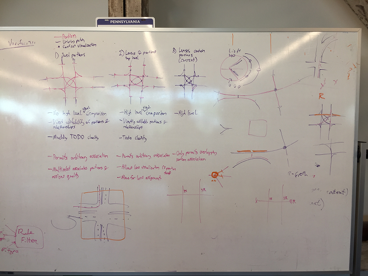
EARLY WHITEBOARD FROM COLLABORATIVE DISCUSSION WITH CONFLICTS ENGINEER
When problems did arise, they were easily addressed.
Problems in design reviews were caught early due to the frequency I updated users and stakeholders. When issues came up later, they were mitigated easily because I ensure design specs are complete. In one case, an engineer was concerned with the zoom functionality, but after a follow up discussion and review of the spec he was comfortable in how the issue would be addressed.
Solution
Due to these issues, there was a strong case for custom visualization and interaction patterns for this specific annotation.
Working with users, I went through several iterations of design for visualization and input mechanics. We landed on an approach I called “lenses”.
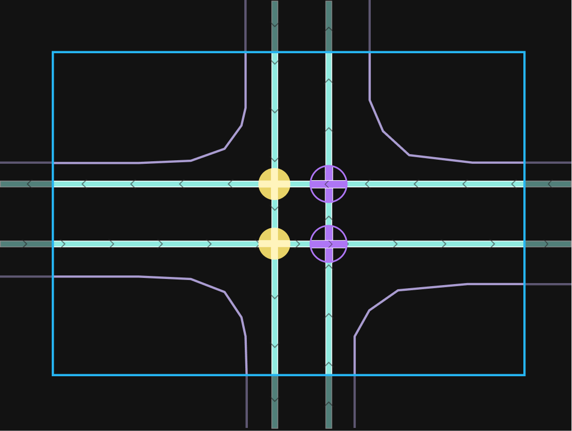
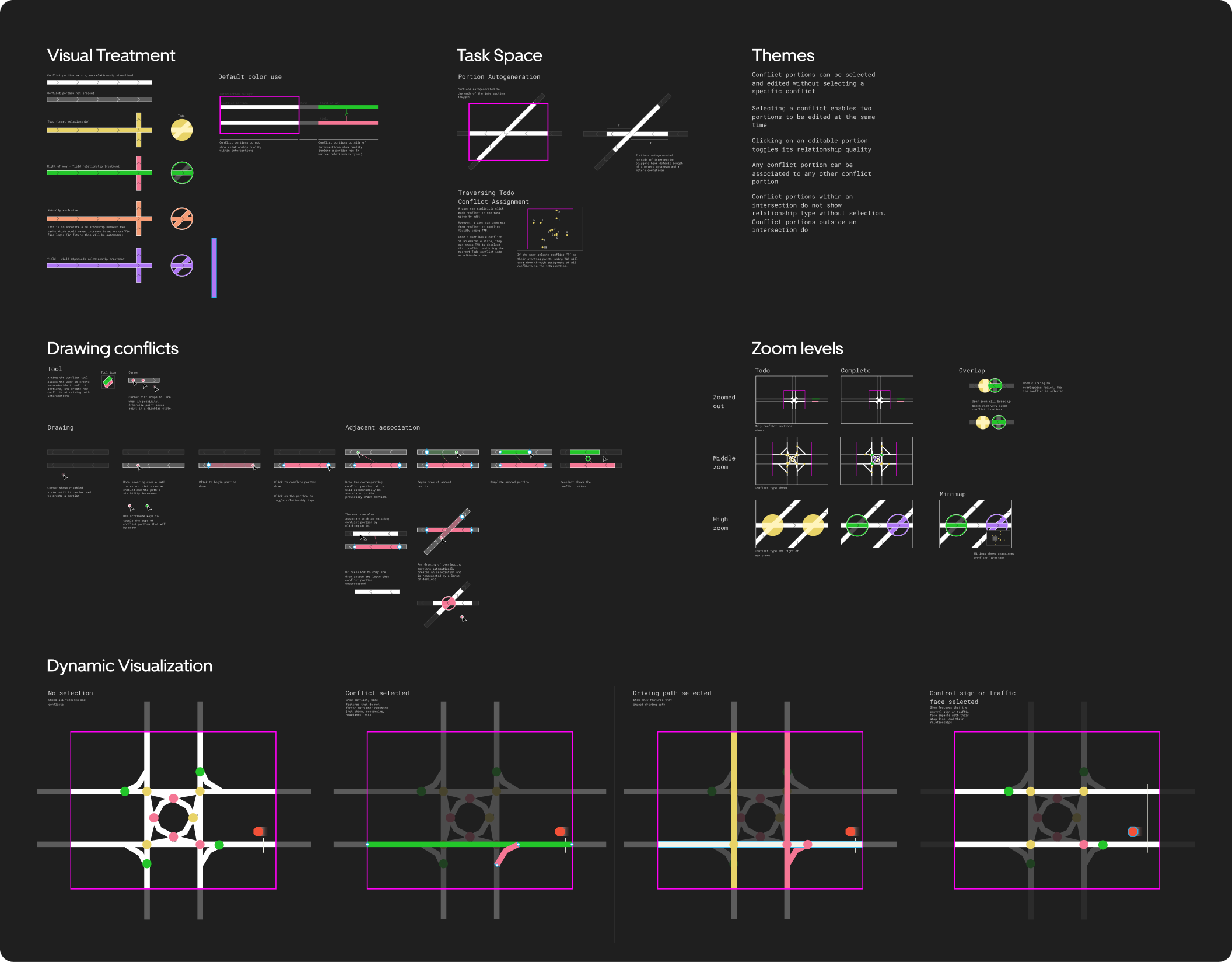
EXAMPLE OF LENSES VISUALIZING CONFLICT STATES
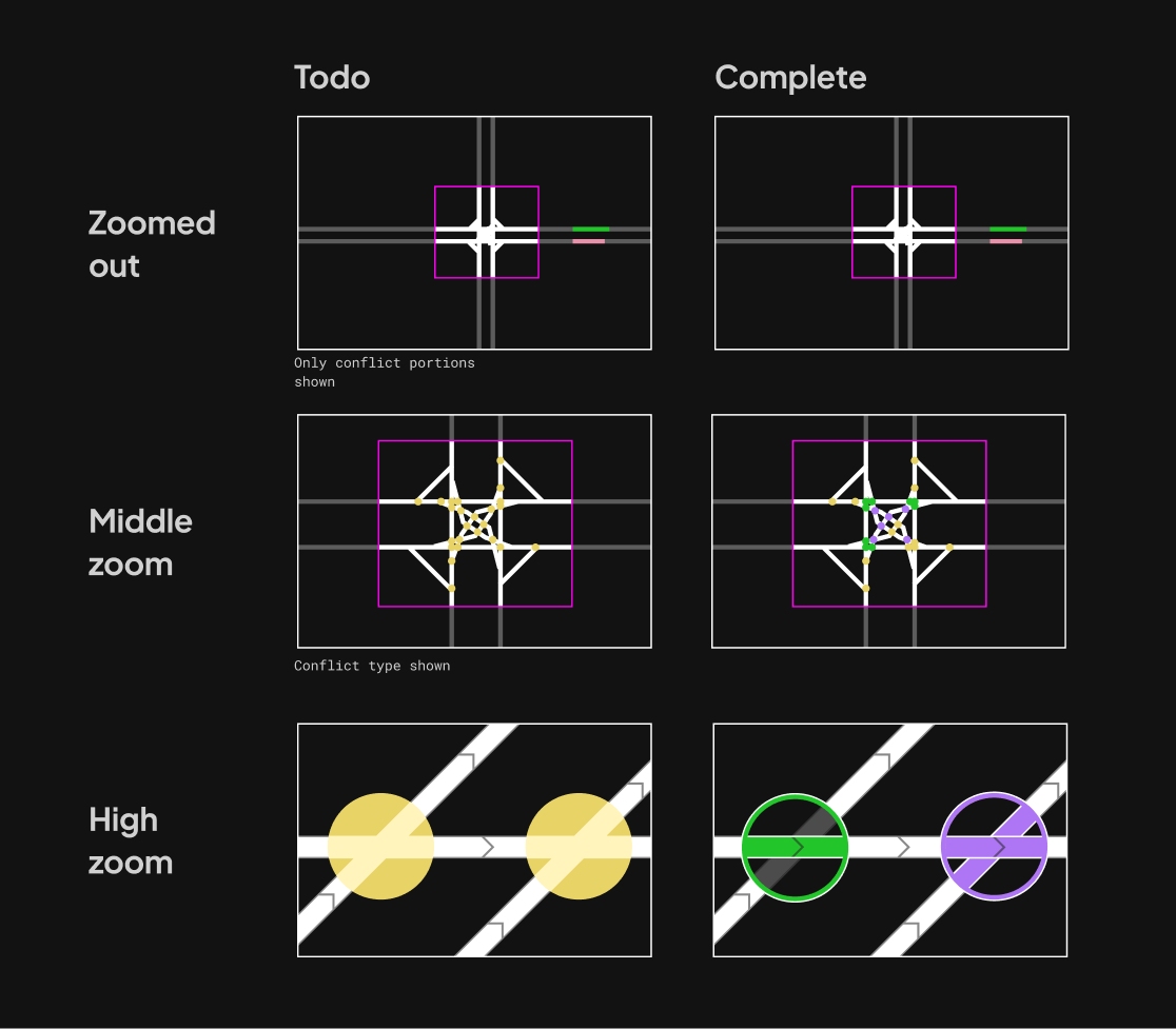
Conflict lenses allowed users to easily visualize all conflict relationships on a map, or within their workspace.
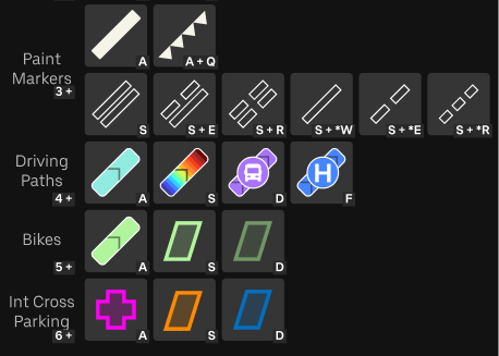
Conflicts that needed a relationship assigned would be yellow. Right-of-way relationships visually indicated the dominant path. To assign relationships quickly, users could use hotkeys to quickly cycle through conflicts in their view, and use additional hotkeys to assign relationships.
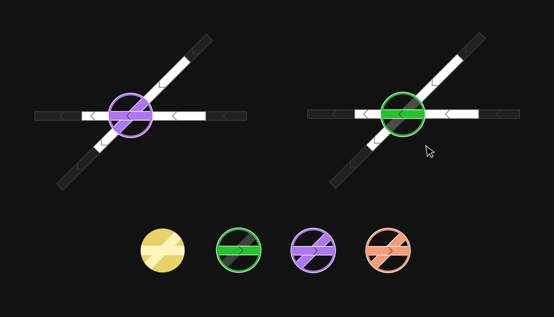
SAMPLES OF CONFLICT LENS STATE VISUALIZATIONS
Due to the visual density of conflicts in a given area, I designed alternate visualizations based on zoom level.
At higher zoom levels, actionable and more detailed information was provided to the user. At lower zoom levels, when no actions could be done by the user, the visualization gradually becomes more simplified.
SAMPLES OF CONFLICT LENS STATE VISUALIZATIONS
Two user-driven refinements stood out: a yellow “to-do” state for unfinished conflicts, and hotkeys to expedite assignment.
In both cases, these feature ideas came from collaborative discussion of user needs and thoughts on the fly, and throwing out design ideas to see what sparks a user's interest.
Impact
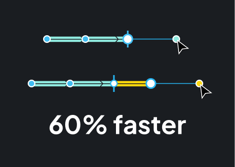
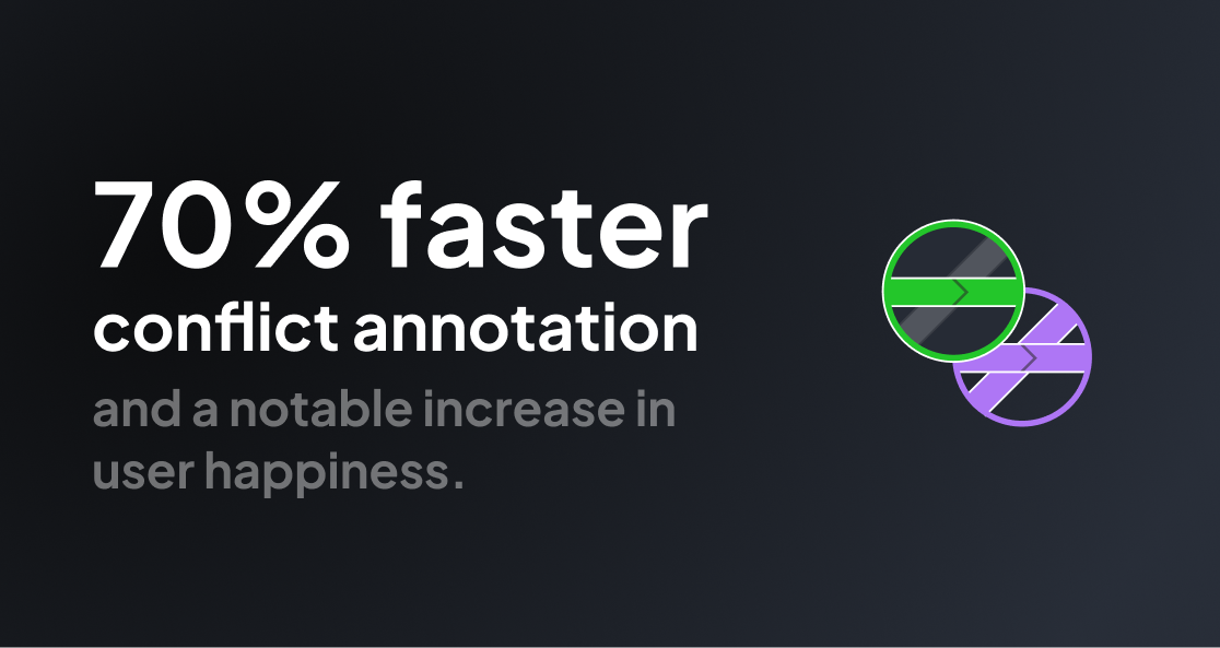
After implementing these changes, map production was able to deliver conflicts 70% faster while maintaining accuracy.
The combination of hotkeys, visualization, and the reduction of user actions to constantly select map features allowed the product team to work more easily and quickly.
That equates to significant savings to the business, and better retention of mapping staff.
As conflict annotation is roughly 8% of the requires total map features for any city, that equates to a projected total $80k/mo in savings based on the efficiency improvement of this feature alone once we scaled out to India.
Further, users were extremely relieved to have this improvement to conflict workflows. Q/A teams no longer needed to struggle to audit. Mappers also now could easily leverage the new visualizations and hotkeys to do work more easily, and increase their output metrics (used in their annual review). A more enjoyable job is one you stick with.