Context & Problem
Our internal specialized mapping team costs over $250k/mo to run. They're using our product Map Maker 8 hours a day, 5 days a week.
Efficient use saves the business capital, and enables users to achieve better employee reviews. Everyone wants to be able to work more easily and effectively.

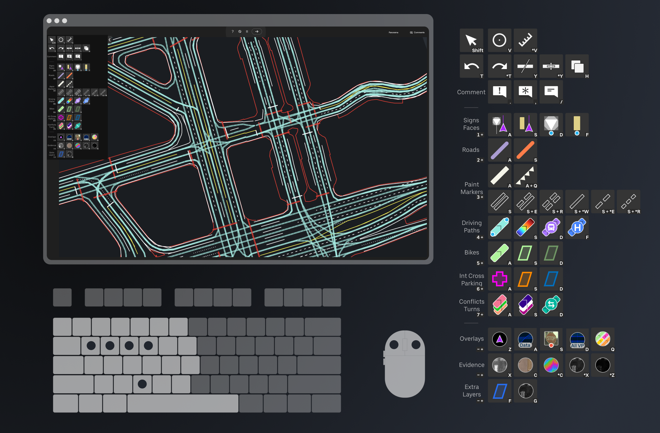
MAP MAKER INTERFACE WITH COST METRIC
The business was also planning a significant expansion to India, multiplying our user base.
Not only was efficiency important, but onboarding had to be faster. Map Maker is a very specialized product to our business, so shortening a highly technical learning curve for new users was also top of mind.
As mentioned in prior case studies, at this point we were roughly 6 months away from an expansion to India for the Map Maker user base. That would add $1.2M/mo in new user cost, all depending on our application. Efficiency gains before rollout would have significant effect on operational cost and scaling output.
Strategy & Collaboration
Keeping these goals in mind, I worked with users and management to identify the largest areas of potential improvement.
I conducted numerous observations of our users doing their day-to-day tasks with our product Map Maker, had many chats with users to gain their thoughts and ideas, and interviewed stakeholders for their thoughts and concerns.
Competitive analysis and user ideas gave us plenty of options for improvements, which were consolidated into 3 options and taken into user testing.
Each option had efficiency improvements over the current schema. To identify the best option, I created simple high-fidelity prototypes and had 8 users test each of the 3 options.
HIGH FIDELITY USABLE PROTOTYPE TO TEST USER INPUT PREFERENCE
Ultimately users preferred a unified shortcut schema.
Users liked that shortcuts didn't require them to move their mouse from their active work area. This allowed them to maintain their focus, and mouse position on the map, which helped them continue tasks more quickly.
RESULTS OF HIFI PROTOTYPE USER TESTING
PM had initial concern about shortcuts, and how that would impact user adoption.
Keeping the plan to scale to India top-of-mind, an operational concern my PM brought to me was the speed at which new users could figure out and utilize hotkeys. This added two valuable constrains: the hotkeys had to be easy to learn, and they needed to have a simple mental model that was easy to remember. These will come up later.
The engineer implementing the UI was skeptical of some visual design I'd tested, so I made him my co-researcher.
The engineer didn't agree with a visual representation of early design for shortcuts in the UI. Visual design is subjective, so in order to gain some data to help us decide on the best course I enlisted 2 map production users for a brief user test, showing them the two options. The engineer sat with me, and we both asked them (without bias) which they preferred, and to explain why.
After that, the engineer was comfortable with why the option users now chose was what we'd build in. He felt his say mattered, his concern was taken seriously, and came away with a deeper understanding of the design and of the research process.
Solution
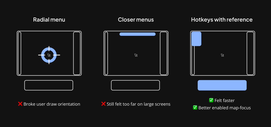
The shortcut schema had to allow users to keep their right hand on the mouse.
Borrowing from professional gaming, there is an idea of hand orientation. If you break orientation, you have to look down to position your hands over shortcuts correctly. This causes a delay and requires the user to reorient when they return their attention to the map.
To enable our users to maintain their focus on the screen, they must have their hands over one primary section of the keyboard. Because our users also need to keep their right hand on the mouse for drawing and selection, that leaves only about 60% of the keys on the keyboard as viable shortcut options to be used by the left hand.
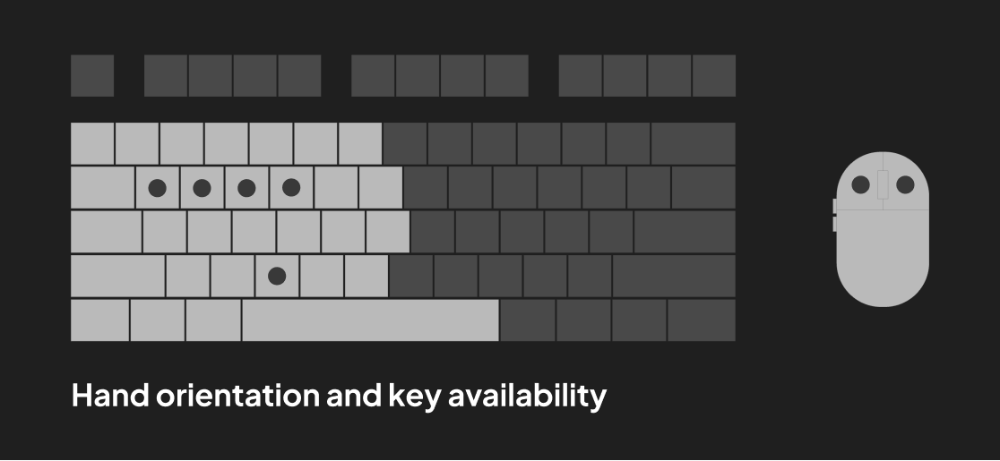
HAND ORIENTATION DIAGRAM
The shortcut schema has to accommodate a growing list of 50+ functions, with less than 30 easily accessible keys from the left hand.
To overcome this constraint, I designed the schema such that some keys toggled the tool categories of other keys. Some keys engaged tools, some switched tool categories, some had designated high-frequency functions, etc. This approach allowed us to flexibly expand the feature set over time without breaking the schema.
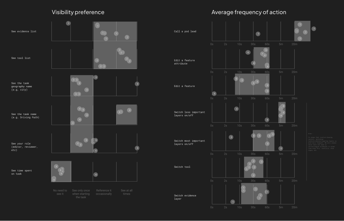
USER SURVEY RESULTS ASSESSING WHAT ACTIONS SHOULD BE MOST/LEAST ACCESSIBLE VIA SHORTCUT
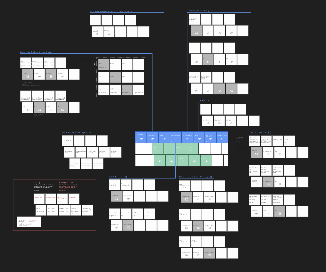
SHORTCUT SCHEMA KEY STATES BASED ON SELECTED TOOL CATEGORY
Onboarding had to be fast, and easy to understand. The keyboard schema then required initial training.
As our user base uses the Map Maker application full-time, the schema had a validated case for the investment of adoption, given the significant efficiency boost once the user was used to it. However, the schema needed to be easy to learn and easy to reference.
The schema was designed around a simple category system to allow for a mental model that was easy to remember. I created a simple 5-minute onboarding guide that allowed any new user to learn the schema quickly, and start using it on their first day.
This approach addressed my PM's initial concerns with potentially slow onboarding and difficulty of use.

HOTKEYS GUIDE SAMPLES
Next, I collaborated with users to design new tool visuals in the application, to act as an easy reference for what shortcuts corresponded to what tools.
This would allow users to easily reference shortcuts they'd forgotten, while allowing them access to tools if they decided not to even use shortcuts.
These ideas resulted from a fruitful discussion session with some particularly passionate World of Warcraft players in the Quality Assurance Team using Map Maker. We talked through my design goals and constraints, and how Blizzard's game design team approached similar problems, and resolved them.
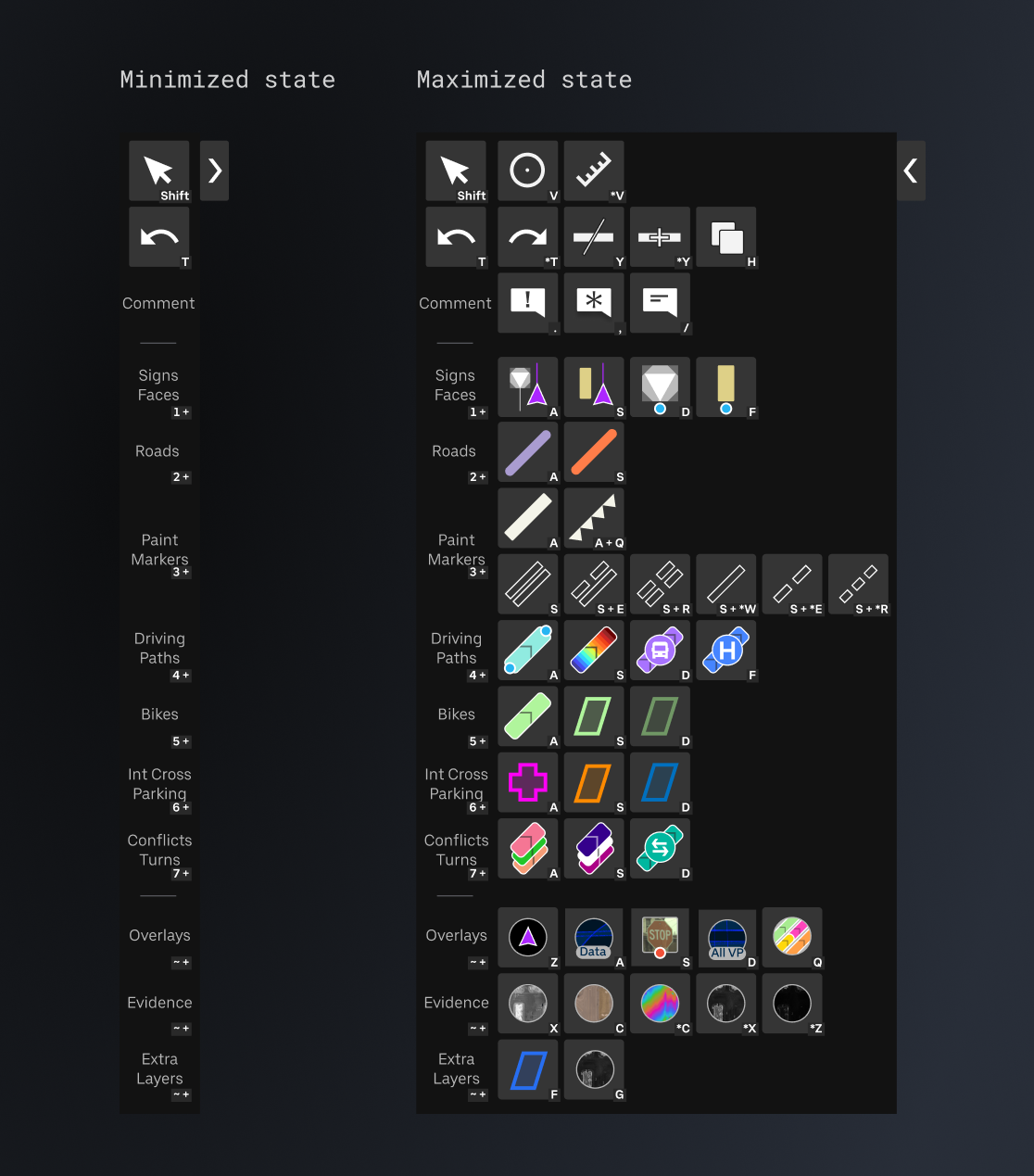
MAP MAKER TOOL PANEL WITH SHORTCUT REFERENCES
Impact
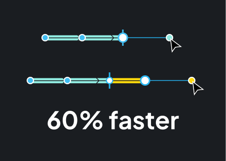
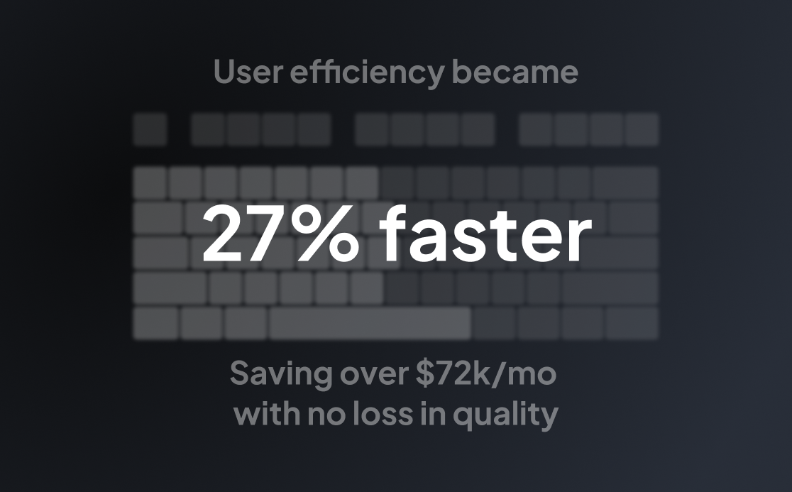
In the coming months after shipping this feature, we saw a 27% improvement in efficiency across all users, saving the business $72k/mo at our current scale.
Once the expansion to India was operational, that savings would scale to roughly $400k/mo across both Pittsburgh and India teams. Further, the team in India would be set up faster due to the hotkey schema onboarding’s simple and fast adoption guidance.
EFFICIENCY STATISTIC
Users loved the hotkey improvements.
Immediately after release, users loved the schema. They could remember it easily, they had access to everything they needed, and they didn't have to break their focus to switch tools. Efficiency increased as well as user morale and trust in my team who supported them.
Years later, a coworker still at the company told me that management had considered changing this shortcut schema, and was met with a user uprising demanding that it not change.